


April 29, 2021: Understanding Your Curve Dashboard 🧑💻📈
How to interpret the numbers on the Curve user dashboard

How long does it take to understand Curve? It can take 5 minutes, or a lifetime. Fortunately you can make money using it even if you don’t understand it. For a long time, Curve didn’t even have its wonderful user dashboard, so unless you were running all the right calculations yourself, you were effectively aping blindly 🙈
The new dashboard gives you a lot of numbers, but some people still aren’t sure what the money is or how it flows across the ecosystem. Everybody just wants to know “How much am I making?” or “How much could I make?” and the answer is a lot like most relationship statuses… it’s complicated. For this reason, we’ve put together a short breakdown of the variables at play on this dashboard.
The total balance at any given time is a function of four factors. The first two relate to the underlying balance, the second two relate to the rewards gauge. The first two are only if you click “Deposit” and serve as a liquidity provider, the last two are unlocked if you click “Deposit and Stake in Gauge” which allows you to earn rewards.

Liquidity Provider Balance Balance
If you only “deposit” and don’t “stake in gauge,” then your dashboard is quite a bit simpler. You are just a liquidity provider, and you should not expect to earn any “Claimable Tokens.” Your profits will be represented in the “Balance” and “USD Profits” areas of the dashboard.
The two factors that can affect your displayed wealth in this case are:
Balance: related to Base APY
Spot Price: the conversion to USD if token is not USD denominated — ie BTC, ETH
In this instance, the most relevant value will be the Balance column. Here we consider a random user who has a few hundred dollars and left it unstaked.

In this instance, Balance (in orange) is an actual amount, the variable you expect will increase slightly over time as fees get automatically redistributed through the pool to liquidity providers. As users interact with the pool and this user earns trading fees, these fees are returned in the form of increasing the Balance.
Retroactively, Curve also computes an effective Base APY and estimated daily USD Profits (in red). The red values are not necessarily precise, but serve as a good benchmark for how your balance would change throughout the year if this level of activity remained constant. If a user deposits $1000, they might find their Balance has increased to maybe $1006 after a year if the Base APY held roughly steady.
If the pool is not denominated in USD (ie BTC, ETH, Link), then the Balance column will be highly sensitive to the current Spot Price of the asset. The Spot Price is not displayed on the interface, all prices are pulled from CoinGecko whenever you reload the page. All assets are then converted to USD in realtime.
If you are in a Bitcoin pool, for example, the effect in the orange Balance column due to the effect of the Base APY may be difficult to detect. Your BTC might have turned into 1.01 BTC over time, but because Bitcoin is volatile and the Spot Price may have dropped 10% you won’t really be able to tease out the change in balance easily. This is where the red values provide a useful estimate.
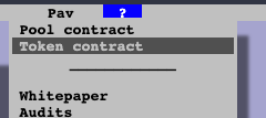
If you want to get your exact Balance at any point in time, the most accurate way to retrieve the exact amount is to read this directly from the blockchain. If you are not staked in the gauge, you can most easily find this by navigating to the pool on the Curve website and selecting the “Token contract” in the upper right hand help (“?”) menu.
Then on Etherscan click through to Contract > Read Contract > balanceOf and paste your address.

Rewards
Fortunately for Curve users’ pocketbooks, most users opt to stake in the rewards gauge. This makes a huge difference. While the ~1% APY in liquidity provider fees a pool might earn by itself is nice compared with the boomer basis points you get in a tradfi bank account, the rewards is where things get juicy. Especially if you take care to maximize your boost by locking $CRV.
If you want to know the exact values of your rewards from the dashboard, the relevant factors are:
Claimable Tokens: How many raw tokens available for withdrawal, which relates to the Rewards and Profits Columns
Spot Price: The conversion rate to USD.
For demonstration purposes, I couldn’t use my own holdings since my wallet is even smaller than my brain. Therefore I “volunteered” the wallet of the wealthiest Curve Market Cap user. Have fun feeling poor… or possibly feeling quite rich depending on your fortunes.

I’ve obscured the address, even though it’s all public data. You might just assume I’m doxxing one Michael Egorov here, but note that the boosts aren’t maximized. We have to assume if he’s galaxy brain enough to have architected Curve’s entire ecosystem before most people had heard of DeFi, that he’s also smart enough max out his boosts.
As before, the user is getting liquidity provider rewards (actual values in orange, derived values in red). Yet this user is also earning a lot of Claimable Tokens (green), the actual values are unrealized gains until they are withdrawn from the rewards gauge. Unless you withdraw, the numbers in green will always stay the same or increase every time you refresh the page. Rewards are emitted on a fairly predictable schedule, but may fluctuate somewhat due to factors like the number of other users who are staking.
The values in blue are helpful derivations that serve as estimates related to rewards. The Rewards APY will fluctuate so the numbers are the best possible estimates. This column is most useful to see if you have fully optimized your Curve. If you are not staked in gauge, you will not see the helpful my: X% symbol — this user chose not to stake their $.003 in USDK for example. If you are staked in gauge, you can compare your number to the range presented on each line to see how close you are to the maximum boost.
For example, the whale displayed above in the HBTC pool is currently getting 8.26% rewards in the form of CRV, a bit higher than the 6.92% minimum, but they would need to stake $CRV more to get to the 17.30% maximum. The exact value they would need to stake to achieve the maximum boost can be derived from the CRV minter.
In the bottom right is the sum of all the tokens accrued. Additionally, the value highlighted in yellow on the very bottom right is a helpful total of your entire reward earnings to date in USD. This is computed as the sum of your tokens times their Spot Price at the instant you view the page. As a result, you may find this number could decrease even as the raw number of tokens increase, if the tokens are losing value.
One thing to note, is that any earnings from the Base APY (red and orange) do not show up in the claimable tokens (green, blue and yellow). These values are estimated as the USD / timeframe earnings, but because it directly compounds to your balance it is not included in calculations on total tokens.
If you want more exact values, you can follow the steps as above, except that you will want to query the contract’s rewards gauge address, which you can find here: https://curve.readthedocs.io/ref-addresses.html
Next Steps
It’s a lot of moving pieces, but not all that difficult once you know the ins and outs.
We’re considering capturing some of this data for you on Curve Market Cap, since these dashboards are all public. Before we build anything though, we want to gauge interest, so take a look at this survey and tell us your thoughts if this may be of value for you: https://forms.gle/zj9bVEjqDNyuEbBt9
Thanks to Michael Egorov for fact checking! For more info, check our live market data at https://curvemarketcap.com/ or our subscribe to our daily newsletter at https://curve.substack.com/. Nothing in our newsletter can be construed as financial advice. Author is a $CRV maximalist, but neither the whale nor the guppy pictured here.