
Big Crypto Poll Part 1: Demographics
Crypto users by sex, age, relationship status, region, education and politics


Part 1 of our multi-part series unpacking our Big Crypto Poll! To read the rest of the series, check out our intro:
Big Crypto Poll: Results 🗳️✅

We asked, and you answered. In late 2024, we conducted our first ever Big Crypto Survey. You gave us reams of data, qualitative and quantitative, and we’ve been sorting through it ever since.
Much of our demographic data confirms what you may have noticed if you attended any IRL crypto conference. We saw relatively few surprises in this section, except to confirm that our sample of responses was solid and passed the sanity check. It’s a good sign that we can trust the findings in future articles.
We also use this article to introduce and familiarize you with two types of plots we’ll use occasionally in future articles, boxplots and dropoff charts.
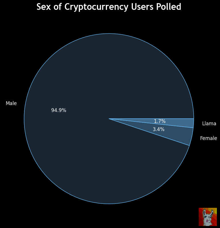
SEX
Little surprise to anybody who’s attended any crypto conference, our industry is overwhelmingly male. We laughed at the write-in vote for “Llama,” though we doubt it would be recognized federally.
Speaking, as always, of sex…
RELATIONSHIP STATUS

The plurality of survey respondents are married. Does this buck the stereotype of crypto users as celibate incels living in their parents basements? We were polite enough not to ask whether overinvesting into crypto had led to celibacy, so we’ll never know.
Q: What is your biggest pain point in crypto?
A: Trying to explain to my wife
Vegas crypto class of ‘17, ~400 tx/month
The nice large cluster of married versus unmarried users means we can already start to tease out some inferences from the data.
For instance, are bachelors more likely to enjoy memecoins? Perhaps, although the effect, if any, is slight and only can be detected at the margins.

ABOUT BOXPLOTS
For the uninitiated, the above chart is a boxplot. We’ll use this chart type a lot because it’s very useful for visualizing data distributions across groups, so it’s useful to train you on these early. The different features of the boxplot represent:
Box: Represents the middle 50% of the data (the "interquartile range" or IQR). The line inside the box is the median (the midpoint of the data).
Whiskers: Extend from the box to the smallest and largest values within 1.5 times the IQR. They show the range of most data points.
Outliers: Data points outside the whiskers are shown as individual dots, highlighting unusually high or low values.
You don’t need to memorize all this. When looking at a box plot, just pay attention to the thick line representing the median. From there, just know that the data sort of falls into the features of the chart. As you go from box to whisker to dot, it becomes increasingly likely to just be noise. It’s a good answer to how to deal with outliers… maybe it’s relevant, maybe not… you be the judge.
For the above chart, you can interpret that fully half of respondents, when asked about their interest in memecoins on a scale of 1-5, picked the lowest. The remaining half appears to have skewed a touch higher on the margins.
Finally, a CYA… when playing with small sample sizes like we are, we wouldn’t dare overinterpret the data in the above chart. What we see is a few outliers at the margin that hint at a potential correlation between marital status and memecoin interest. It’s also just as likely to be noise. In stats lingo, your mission is to “reject the null hypothesis” — the default hypothesis that any variation in data is the result of random chance.
For instance, if you looked at just the averages, you would have to squint to see any trend. There’s only about a -4% correlation between the two.

By no means can we “reject the null hypothesis” in this case, but we can present this as a potential lead for researchers to explore further. Hence why boxplots are useful in sniffing out trends that may or may not exist.
For a final lesson in boxplots, we can look at how it looks for a variable where you can quite likely “reject the null hypothesis” — we’d probably all agree it’s uncontroversial to suggests that age is likely to correlate with marital status. Our data unsurprisingly agrees.
Here is how it looks as a raw average.

Age and relationship status was the stongest correlation, about 48%. Here is how it looks as a boxplot:

If your boxplot looks like this, you probably have a strong chance you can reject the null hypothesis. Nearly every facet of the boxplot for married users is situated above the unmarried user equivalent. No data points exist as outliers.
With this in mind, are there any interesting extrapolations we could posit about married crypto users relative to bachelors? Ignoring some of the obvious correlations with other demographic factors (ie education level, income), we’d suggest there may be some correlation worth exploring between marital status and interest in Bitcoin, about a 17% correlation:

Further, married users were about 13% more interested in DeFi than unmarried users.

Probably nothing, since nearly everybody in our sample was strongly interested in DeFi, but you can see that trail of outliers…
OK, we’ll consider you trained on boxplots from here on out. Next up is dropoff charts, which work well with this very subject.
AGE + DROPOFF CHARTS
We plot the age of respondents as a cumulative dropoff chart.
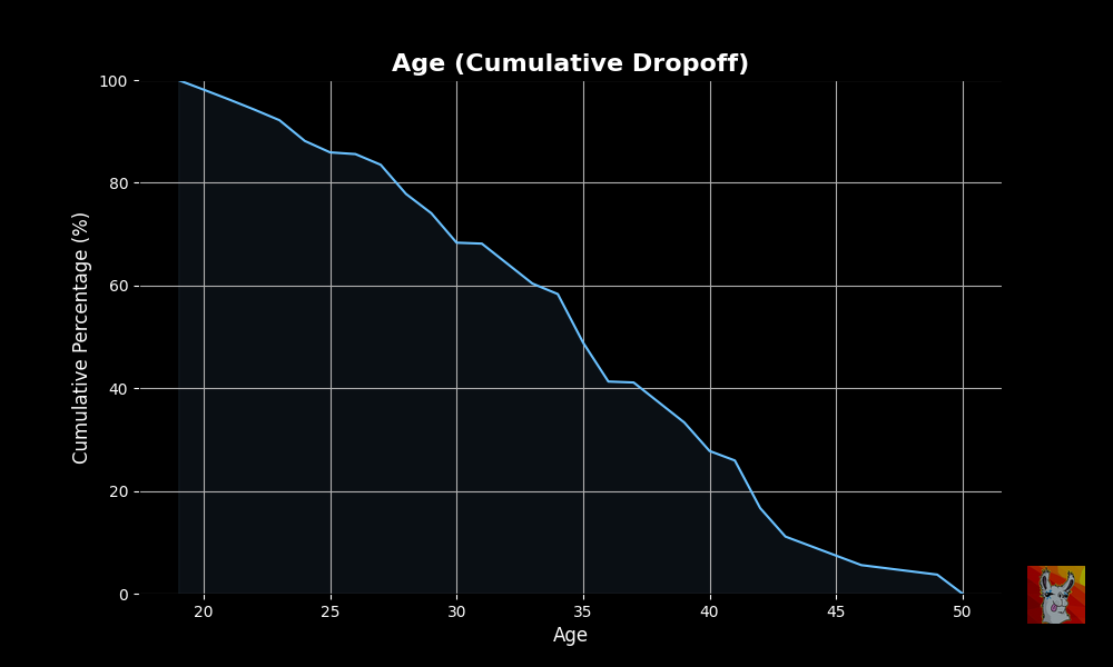
This chart can be read such that the left most extreme, 100% of respondents are 18 years or older. As you progress right along the x-axis, the y values (representing percent of respondents) drop continuously. The y values cross the 50% mark (ie the median), at age 34. The intersection here means half the respondents are above and half the respondents are below this marker. We had no respondents above the age of 50, and accordingly the plot falls to 0% at this mark. Easy, right? We’ll assume you got this unless you drop a lot of questions
Is this age range skewed relative to the broader crypto community? As a sanity check, we pressed ChatGPT, Grok and Claude to guess a median value of crypto, and they all said 34. We suspect our numbers are pretty much right in line with the broader crypto community.
Region
One place where our data does appears to be skewed is that the plurality of respondents were in Europe.
