


Nov. 17, 2021: Eyes of the Behodlers 🎨🖼️
Reactions to Screenshots of Curve's New UI

Curve’s Discord really is a perfect reflection of its culture.

Naturally, Curve boasts active channels dedicated to software development and advanced math. Nowhere to be found is design, NFTs… none of that right-brained stuff.
When people ask why the new Curve UI has taken so long? Largely because design is never really the priority.

However, when Curve recently dropped a screenshot of the new UI for feedback, something happened that could make even Curve take an interest in design topics. Specifically: enough responses filtered in that the problem could be attacked using precious data.

This simple tweet has already generated 162 responses and counting. Whenever n > 50 you get to an almost statistically significant sample size. Therefore we can extract some useful trends.
Replies mostly fell into a few basic topics. If you’d like to review the data yourself, check here. The sentiment scores were all manually reviewed and adjusted at human discretion, since services like IBM Watson might choke on a meme of Chad with an enlarged marsupium.
Sentiment toward Chad Mode
They say beauty is in the eye of the beholder. Indeed, we see a split.
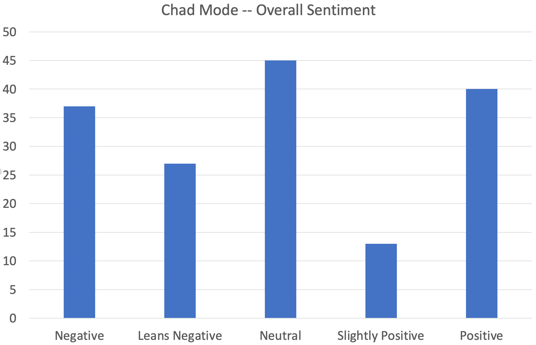
While hard positive sentiment outweighed hard negative sentiment, when softer sentiment was considered the overall opinion turned slightly negative.
The sentiment gets far more negative when you consider weighting by Twitter likes. Very few people amplified the positive statements, while ragging on the design was very popular.
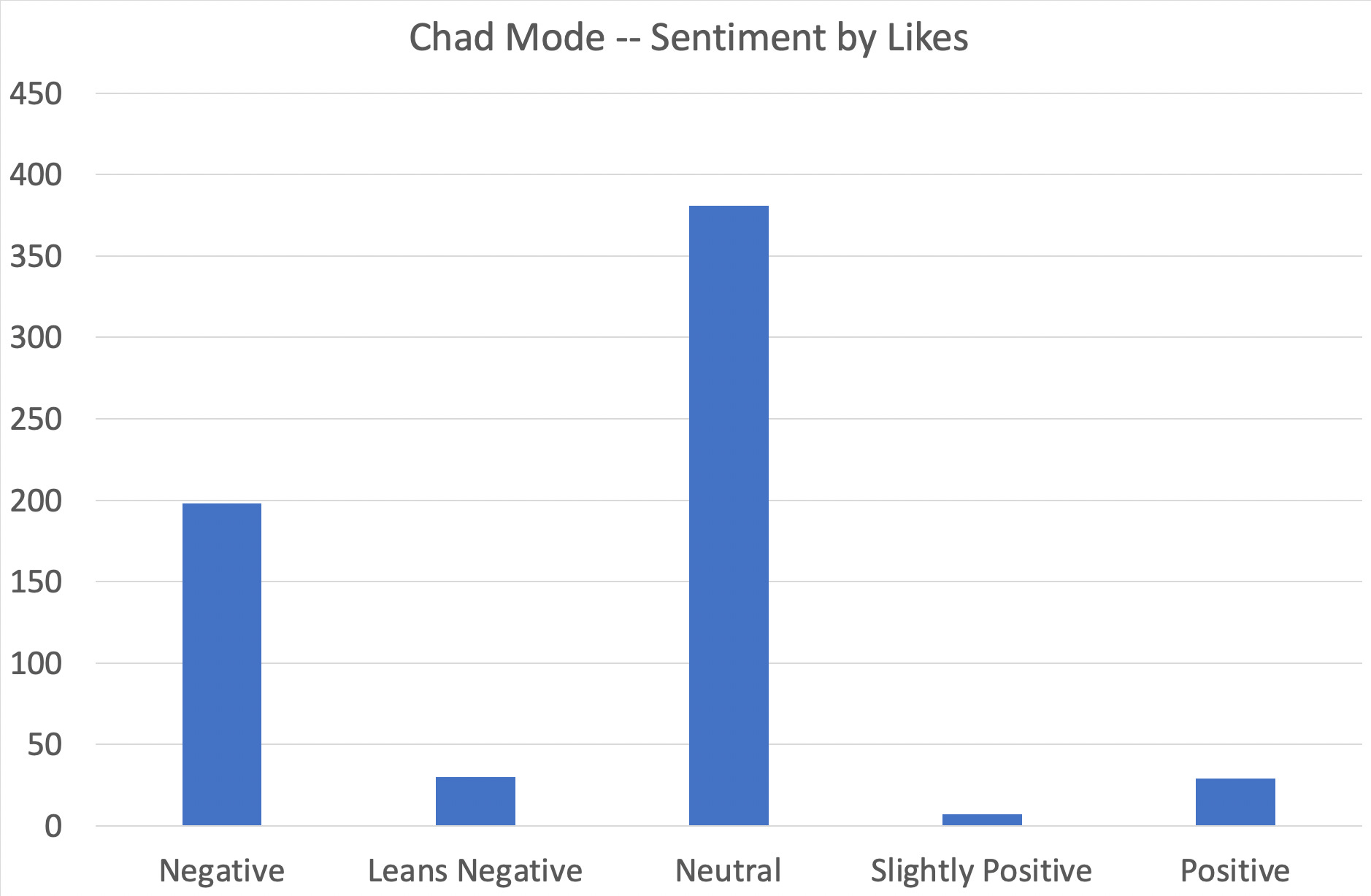
Admittedly, a sick burn is always fun to read. I personally liked the UI, but even I had to admire the audacity of this devastatingly low blow that accounted for a third of the likes on these negative posts.


CREAM Finance? Yeowch, that’s going to leave a mark.
Sadly, the community does not interact via a truly Web3 enabled social network. A social network connected to your ENS name would be trivial to construct, and this would easily allow you to break down sentiment by net worth. Eyeballing the data, we expect if you considered sentiment on a per Wei basis, we expect the trends would be overwhelmingly worse.

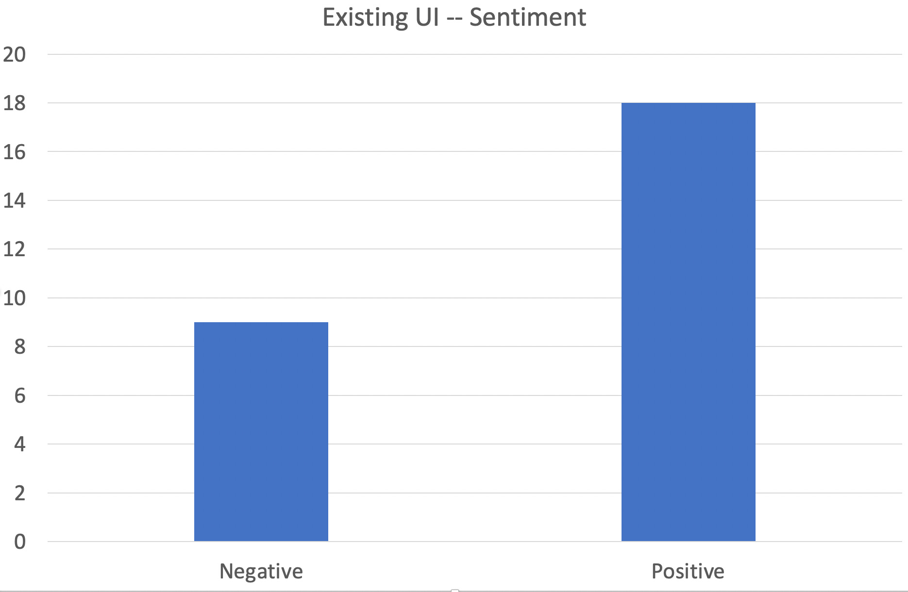
Sentiment toward Curve Classic
One of the quirks of design: it’s quite common for everybody to rag on the design, until you try to change it. The design of Curve has long been one of the only weaknesses Curve conceded, and thus became the lazy person’s criticism against Curve?
If you try to change it though… suddenly everybody likes it. Of the 162 respondents, 33 (20%) mentioned the old UI. This broke down as a 2:1 positive to negative sentiment.
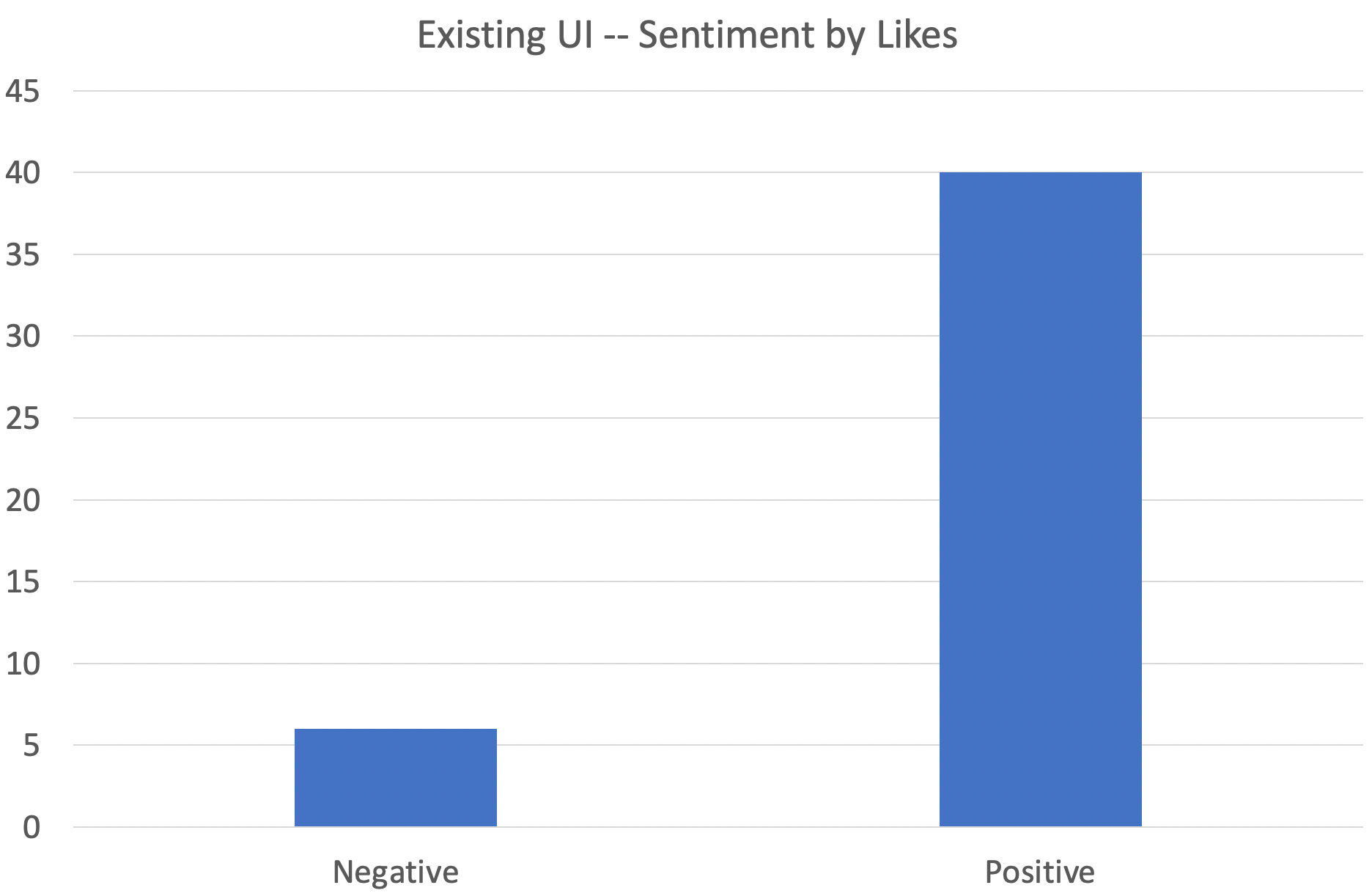
Measured by Twitter likes, the nostalgia proved even more pronounced.
Six posts specifically requested to include a toggle so users could switch back to old UI at any time, (though a careful parsing of the screenshot would indicate this already exists).
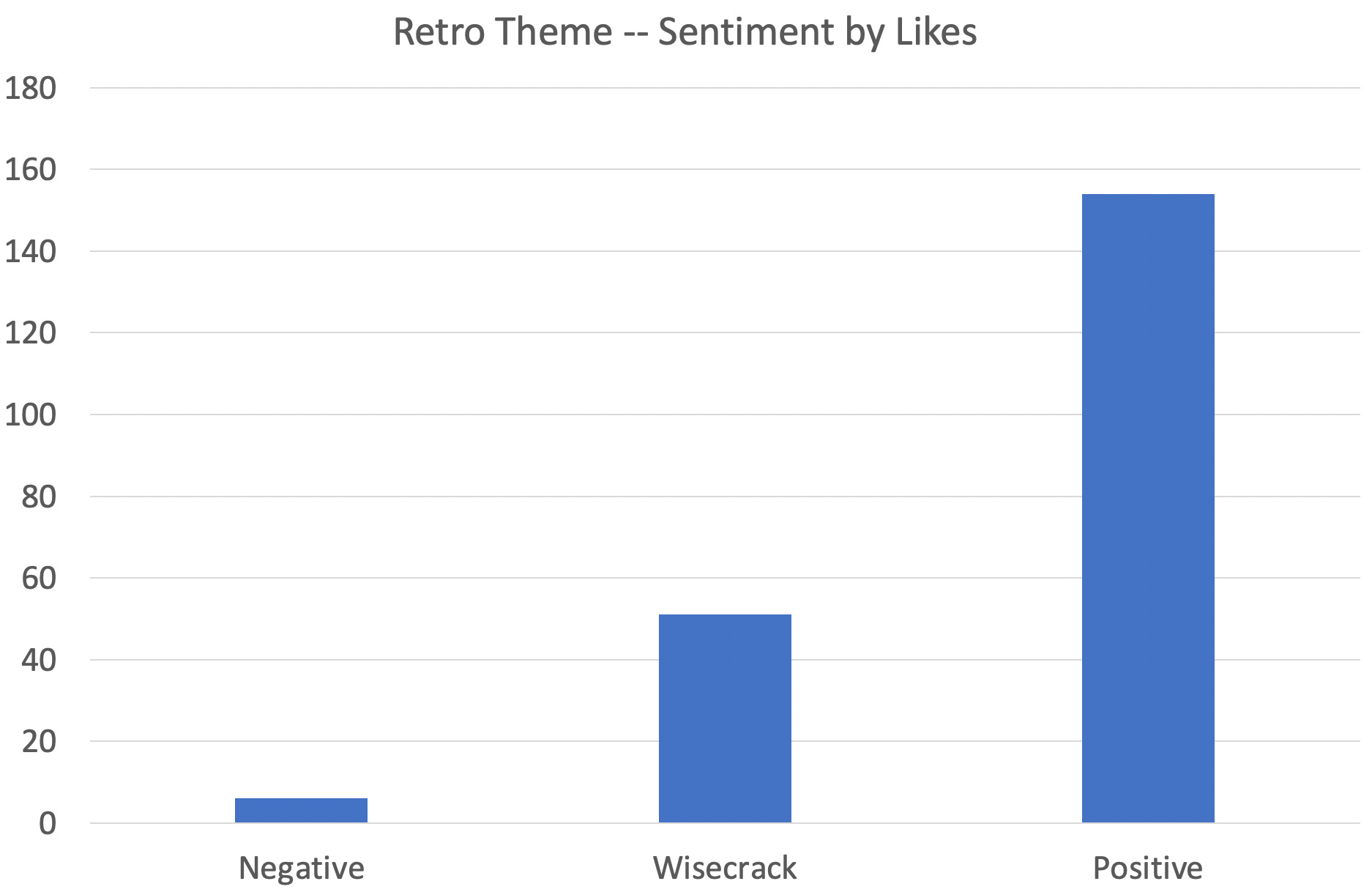
Sentiment Towards Retro Theme
The plurality of responses expressed an unsolicited opinion on Curve’s retro theme, 39 posts (24% of respondents) . By a 3:1 margin, Curve users really like the retro theme — plus another bucket of people who cracked a joke related to this theme. These jokes were presumably positive, but the posts didn’t betray a sentiment one way or another.

Again, when you measure by Twitter likes, the disparity was even more sever.
Two users commented on the retro theme being a style “unique” to Curve. A few suggested playing MIDI music to play as the page loads.

Notably, users were commenting on the theme with far more of a “retro” look than the default UI coming around the bend. Given Curve users’ preference for this “retro” style, one can only imagine how harsh users would have been in their criticism had they been presented with this tidy theme:

Technologies
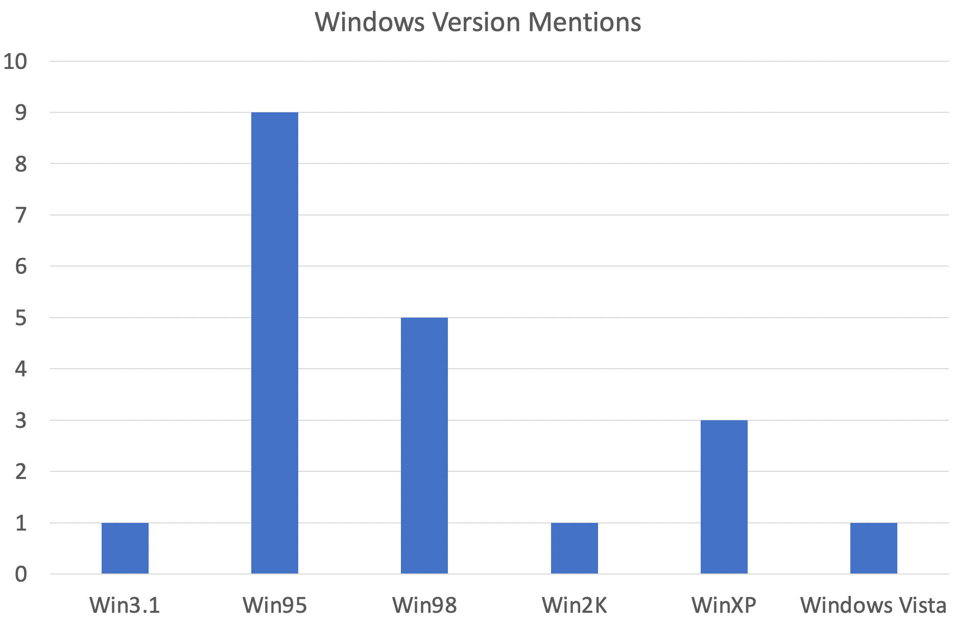
An interesting example of the time dilation of history is that users felt this one screenshot reminded them of technologies ranging all the way from Apple IIE (1983) all the way through Windows Vista (2006). Nearly a quarter century worth of user interface design history, compressed into a single screenshot.
Most common was comparisons to the lifecycle of Windows.
Winamp also got mentioned a few times, perhaps due to the association with llamas. The noble llama got two mentions, both positive.

Requests to push Curve across into the new millennium also proved popular. Perhaps reports of Geocities’ death are premature?

Another popular wish was to push this the theme even further retro, to the point of a simple command prompt.

As somebody who primarily transacts through Brownie and not the UI, — I happen to know the idea of simply firing up a Brownie shell has its advocates within Curve. However this is a bit tougher to implement than reskinning a UI, so don’t hold your breath.
Miscellany
A few other idle observations.
Nine people attacked the designer, with just a couple peddling their own services. Stay classless, Twitter
Four people cited colors, three negative and one positive. Not sure how people can complain when Curve’s logo contains every color.
Out of 162 comments, just 5 people weighed in with productive feedback. Oh well, thanks to number crunching we got some productive info from the data anyway.
Read Disclaimers! Author is a centipede maxi
I wonder if you may be mixing up the usability of the UI with the look of the UI. When I say "I hate Curve's UI" I am talking about functionality problems. When I say "I love Curve's UI" I am talking about the aesthetic.
Curve needs to fix their UI. They don't need to change the way it looks (the design language) very much, if at all.